Rendering text on a screen seems straightforward at first glance. You just put one character after the next one and 🎉 — you have text!
If only it were this simple. Where does the next character actually go? This is easy to answer for monospaced fonts: Each glyph is the same width. But what about normal fonts? Each character is sized differently. Some go further up or down, some are really wide, and some are really slim.
This is where text shaping comes in. It transforms your text from a bunch of characters to characters that have positioning information attached. And sometimes, you even get different characters as a result.
What Is Text Shaping?
The quickest summary is: Text shaping makes text look better. It takes separate characters and, according to some rules, positions them in a way that makes them pleasing to look at.
Text shaping can include applying kerning, substituting different characters, composing characters, and more.
Let’s take a look at a contrived example:
| Unshaped Text | Shaped Text |
|---|---|
 |
 |
Look closely at the position of the comma in the images above. It’s much further away from the P in the unshaped image. The text-shaped image puts it closer to the character to make it look more harmonious.
Text Shaping Required!
Some languages, like Arabic, require more work to typeset correctly. This is usually known as complex text layout (CTL). I’m not an expert in scripts that require CTL, so I’ll keep this section brief and cover what I do know.
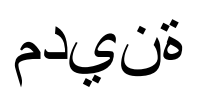
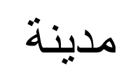
In Arabic, a character can have as many as four different shape forms, depending on the context it’s used in. This means that, for example, the character ة looks different depending on if it’s the first character or a middle character. Furthermore, if we were to put each character one after the other, it’d look completely wrong.
This is where text shaping comes in. Let’s take the Arabic word for city, مدينة:
| Unshaped Text | Shaped Text |
|---|---|
 |
 |
As you can see, without text shaping, this word is completely unrecognizable.
Fonts Play an Important Role
One curious thing is that fonts play a super important role when it comes to text shaping. Many rules of how to shape text actually come from information embedded in the font you’re trying to render text with. While this makes sense, it was never something I considered before. Take kerning — you position characters next to each other to make them easier to read. Of course, this varies depending on which font you use.
There’s a lot of information embedded in a font that describes how text should be rendered. For example:
This also means that to render correct Arabic text, you have to use a font that has all the required information embedded.
How We Approach Text Shaping
There are quite a few different implementations of text shaping available. On macOS, Core Text can take over the work. On Windows, it’s Uniscribe. In the open-source world, HarfBuzz is the most prominent library available.
Because we at PSPDFKit need a solution that works across platforms (and even in the browser using Web Standalone), we chose to use HarfBuzz. It offers a nice API where we can say “We have this text, in this language, using this font; please tell us which glyphs we have to use and where to position them.” We then create the necessary font structures in the PDF, and we convert this into an appearance stream. And finally, for real this time, 🎉 we have good-looking text!
Conclusion
Text is hard, and fonts are complex. But we take pride in doing things the right way and caring about quality — so much that it’s one of our core values.
Most people no longer have to deal with the intricacies of getting text to look nice, because modern software takes care of all of this; it’s an incredibly complex topic that mostly goes on behind the scenes.
But because we take over the low-level work of rendering text into a PDF, we had to take a closer look at this. As a result, all of our SDKs use the same technology underneath to provide you with the best-looking text, no matter if you want to add a free text annotation or fill out a form.
