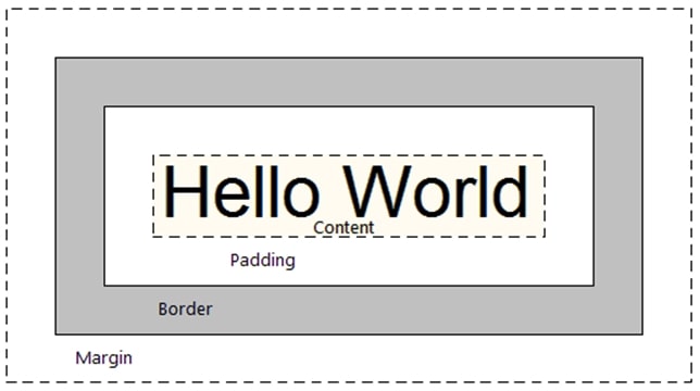
CSS box model is defined as a box around CSS, and understanding these boxes is key to being able to create layouts with CSS, or to align items with other items. In this lesson, we will take a proper look at the CSS Box Model so that you can build more complex layout tasks with an understanding of how it works and the terminology that relates to it.
CSS box model applies to block boxes, inline boxes only use some of the behavior defined in the box model. The model defines how the different parts of a box — margin, border, padding, and content — work together to create a box that you can see on the page. To add some additional complexity, there is a standard and an alternate box model.
Box-Model has multiple properties in CSS. Some of them are given below:
- borders
- margins
- padding
- Content
<!DOCTYPE html>
    <head>
        <style>
        .main {
            font-size:32px;
            font-weight:bold;
            text-align:center;
        }
        #box {
            padding-top:40px;
            width: 500px;
            height: 200px;
            border: 70px solid black;
            margin: 60px;
            text-align:center;
            font-size:32px;
            font-weight:bold;
        }
        </style>
    </head>

    <body>
        <div class="main">CSS Box-Model Property</div>
        <div id="box">Knowledge is power</div>
    </body>
</html>
CSS Box model Parts
Making up a block box in CSS we have the:
- Content box: The area where your content is displayed, which can be sized using properties like
widthandheight. - Padding box: The padding sits around the content as white space; its size can be controlled using
paddingand related properties. - Border box: The border box wraps the content and any padding. Its size and style can be controlled using
borderand related properties. - Margin box: The margin is the outermost layer, wrapping the content, padding and border as whitespace between this box and other elements. Its size can be controlled using
marginand related properties.

CSS Box model -width & height
If you don’t declare a width, and the box has static or relative positioning, the width will remain 100% in width and the padding and border will push inwards instead of outward. But if you explicitly set the width of the box to be 100%, the padding will push the box outward as normal.The lesson here being that the default width of a box isn’t really 100% but a less tangible “whatever is left”. This is particularly valuable to know, since there are lots of circumstances where it is immensely useful to either set or not set a width.
<!DOCTYPE html>
    <head>
        <title>CSS Box Model</title>
        <style>
            .main {
                font-size:36px;
                font-weight:bold;
                Text-align:center;
            }
            .gfg {
                margin-left:60px;
                border:50px solid #009900;
                width:300px;
                height:200px;
                text-align:center;
                padding:50px;
            }
            .gfg1 {
                font-size:42px;
                font-weight:bold;
                color:#009900;
                margin-top:60px;
                background-color:#c5c5db;
            }
            .gfg2 {
                font-size:18px;
                font-weight:bold;
                background-color:#c5c5db;
            }
        </style>
    </head>
    <body>
        <div class = "main">CSS Box-Model Property</div>
        <div class = "gfg">
            <div class = "gfg1">Knowledge is power</div>
            <div class = "gfg2">Portal of information</div>
        </div>
    </body>
CSS Box model- width formula
The total width of an element should be calculated like this:
Total element width = width + left padding + right padding + left border + right border + left margin + right margin
The total height of an element should be calculated like this:
Total element height = height + top padding + bottom padding + top border + bottom border + top margin + bottom margin

Comments are closed.