
CSS Sizing includes so many ways to size items on a web page using CSS. Understanding how big the different features in your design will be is important, and in this lesson we will summarize the various ways elements get a size via CSS and define a few terms around sizing that will help you in the future.
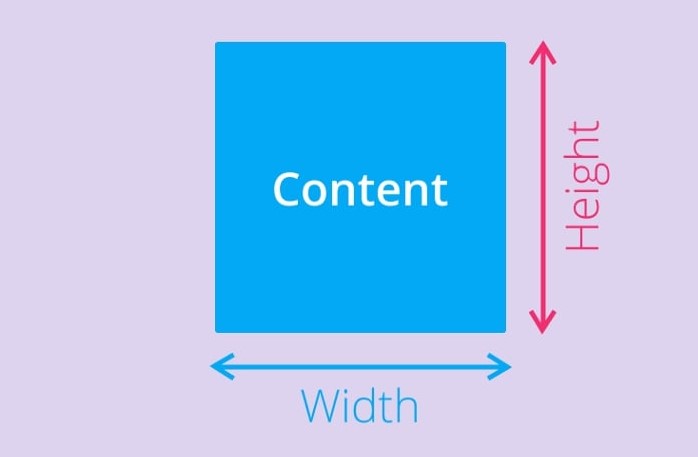
The CSS height and width properties are used to set the height and width of an element.
The CSS max-width property is used to set the maximum width of an element.
  height: 50px;
  width: 100%;
  border: 1px solid #4CAF50;
CSS Intrinsic Sizing
HTML Elements have a natural size, set before they are affected by any CSS. A straightforward example is an image. An image has a width and a height defined in the image file it is embedding into the page. This size is described as the intrinsic size — which comes from the image itself.
If you place an image on a page and do not change its height and width, either using attributes on the <img> tag or CSS, it will be displayed using that intrinsic size.
CSS Sizing-height and width
The height and width properties may have the following values:
auto– This is default. The browser calculates the height and widthlength– Defines the height/width in px, cm etc.%– Defines the height/width in percent of the containing blockinitial– Sets the height/width to its default valueinherit– The height/width will be inherited from its parent value
CSS Sizing-max-width
The max-width property is used to set the maximum width of an element.
The max-width can be specified in length values, like px, cm, etc., or in percent (%) of the containing block, or set to none (this is default. Means that there is no maximum width).
The problem with the <div> above occurs when the browser window is smaller than the width of the element (600px). The browser then adds a horizontal scrollbar to the page.
Using max-width instead, in this situation, will improve the browser’s handling of small windows.
CSS specific size
We can, of course, give elements in our design a specific size. When a size is given to an element (the content of which then needs to fit into that size) we refer to it as an extrinsic size. Take our <div> from the example above — we can give it specific width and height values, and it will now have that size no matter what content is placed into it. As we discovered in our previous lesson on overflow, a set height can cause content to overflow if there is more content than the element has space to fit inside it.
CSS sizing using percentages
In many ways, percentages act like length units, they can often be used interchangeably with lengths. When using a percentage you need to be aware what it is a percentage of. In the case of a box inside another container, if you give the child box a percentage width it will be a percentage of the width of the parent container. With no percentage applied our <div> would take up 100% of the available space, as it is a block level element. If we give it a percentage width, this becomes a percentage of the space it would normally fill.
You might expect for example the percentage top and bottom margins to be a percentage of the element’s height, and the percentage left and right margins to be a percentage of the element’s width. However, this is not the case!
When you use margin and padding set in percentages, the value is calculated from the inline size of the containing block — therefore the width when working in a horizontal language. In our example, all of the margins and padding are 10% of the width. This means you can have equal-sized margins and padding all around the box. This is a fact worth remembering if you do use percentages in this way.