
CSS Media queries are used to modify site or app depending on a device’s general type.
@media screen and (min-width: 500px) {
  body {
    background-color: skyblue;
  }
CSS Media Queries-Uses
Media queries used to check following things:
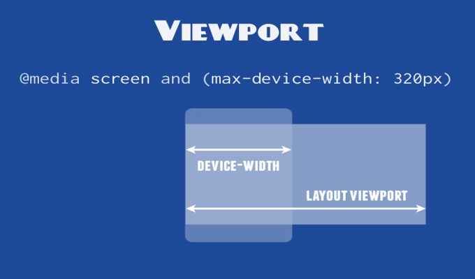
- width and height of the viewport
- width and height of the device
- orientation (is the tablet/phone in landscape or portrait mode?)
- resolution
Media Queries-syntax
CSS media query is composed of an optional media type and any number of media feature expressions. Multiple queries can be combined in various ways by using logical operators. Media queries are case-insensitive.
@media not|only mediatype and (expressions) {
  CSS-Code;
Comments are closed.