
Border-radius allows to create rounded corners with just CSS without the need for graphics or JavaScript. Historically rounded corners were tricky to implement involving a background graphic or even JavaScript. Interface designers would issue a little sigh as designers littered designs with rounded corners.
Rounded Corners can be generated by CSS border-radius property on elements. The value of property can either be in length or percentage units. You can animate the radius as well using a calc() function, percentage or length value.
CSS3 Rounded Corners-border radius (Shorthand)
Following are the uses of border-radius property
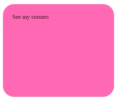
Specify the background color of the rounded element :
<style>#rcorners1 {
    border-radius: 30px;
    background: hotpink;
    padding: 25px;
    width: 250px;
    height: 200px;
}
Long form rounded corners
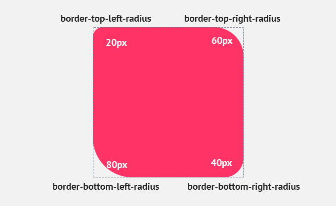
he border radius property is shorthand for border-top-left-radius, border-top-right-radius, border-bottom-left-radius and border-bottom-right-radius. As with writing the padding & margin shorthand, border-radius goes clockwise, from top left, the top right, bottom left and finishing on the bottom right.
| Property | Description |
|---|---|
| border-top-left-radius | It is used to set the border-radius for the top-left corner |
| border-top-right-radius | It is used to set the border-radius for the top-right corner |
| border-bottom-right-radius | It is used to set the border-radius for the bottom-right corner |
| border-bottom-left-radius | It is used to set the border-radius for the bottom-left corner |
.round-corner-box{
 border-top-left-radius: 50%;
 border-top-right-radius: 50%;
 border-bottom-left-radius: 50%;
 border-bottom-right-radius: 50%;
}
If the bottom-left value is omitted, then it will be same as the top-right. If the value of bottom-right is eliminated, then it will be same as the top-left. Similarly, if top-right is eliminated, then it will be the same as top-left.
Let’s see what happens when we provide a single value, two values, three values, and four values to this property.
- If we provide a single value (such as border-radius: 30px;) to this property, it will set all corners to the same value.
- When we specify two values (such as border-radius: 20% 10%;), then the first value will be used for the top-left and bottom-right corners, and the second value will be used for the top-right and bottom-left corners.
- When we use three values (such as border-radius: 10% 30% 20%;) then the first value will be used for the top-left corner, the second value will be applied on top-right, and bottom-left corners and the third value will be applied to the bottom-right corner.
- Similarly, when this property has four values (border-radius: 10% 30% 20% 40%;) then the first value will be the radius of top-left, the second value will be used for the top-right, the third value will be applied on bottom-right, and the fourth value is used for bottom-left.
<!DOCTYPE html>
<html>
<head>
<title> CSS border-radius </title>
<style>
div {
padding: 50px;
margin: 20px;
border: 6px ridge red;
width: 300px;
float: left;
height: 150px;
}
p{
font-size: 25px;
}
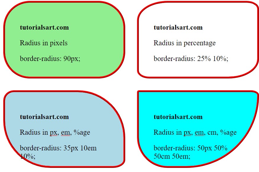
#rad-pixels {
border-radius: 90px;
background: lightgreen;
}
#rad-percentage {
border-radius: 25% 10%;
background: white;
}
#rad-em {
border-radius: 35px 10em 10%;
background: lightblue;
}
#four {
border-radius: 50px 50% 50cm 50em;
background: cyan;
}
</style>
</head>
<body>
<div id = "rad-pixels">
<h2> tutorialsart.com </h2>
<p> Radius in pixels </p>
<p> border-radius: 90px; </p>
</div>
<div id = "rad-percentage">
<h2> tutorialsart.com </h2>
<p> Radius in percentage </p>
<p> border-radius: 25% 10%; </p>
</div>
<div id = "rad-em">
<h2> tutorialsart.com </h2>
<p> Radius in px, em, %age </p>
<p> border-radius: 35px 10em 10%; </p>
</div>
<div id = "four">
<h2>tutorialsart.com</h2>
<p> Radius in px, em, cm, %age</p>
<p>border-radius: 50px 50% 50cm 50em;</p>
</div>
</body>
</html>
Specify the border element :
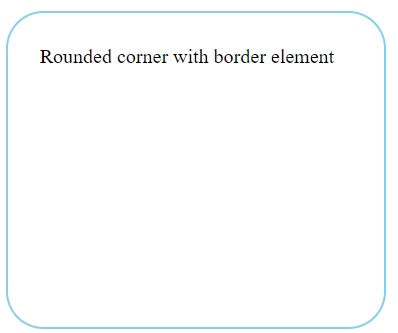
<style>#rcorners2 {
    border-radius: 30px;
    border: 2px solid skyblue;
    padding: 25px;
    width: 250px;
    height: 200px;
}
Specify the background image elements :
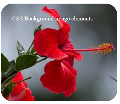
#rcorners3 {
    border-radius: 30px;
    background: url("media/flower.jpeg");
    background-position: left top;
    background-repeat: repeat;
    padding: 30px;
    width: 250px;
    height: 200px;
}
</s
CSS3 border-images
border-image property allows you to specify an image to act as an element’s border.
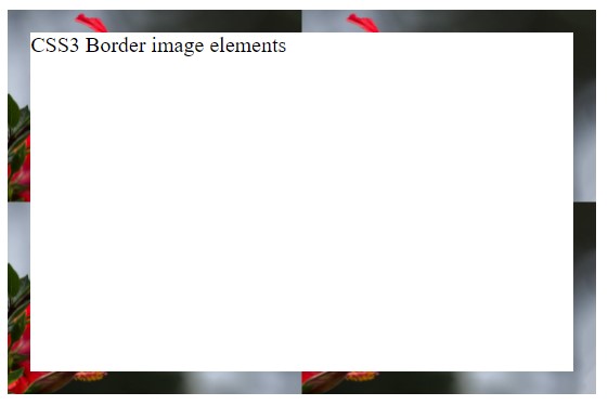
.box {
		width: 400px;
		height: 250px;
		border: 17px solid transparent;
		-webkit-border-image: url("media/flower.jpeg") 40 40 round;
		-o-border-image: url("media/flower.jpeg") 40 40 round;
		border-image: url("media/flower.jpeg") 40 40 round;