CSS units determines the size of a property you’re setting for an element or its content. For example, if you wanted to set the property margin of a paragraph, you would give it a specific value. This value includes the CSS unit.CSS has several options for which units to use when determining the size of various CSS properties.Let’s look at a small example:
In this case, margin is the property, 20px; is the value, and px (or “pixel”) is the CSS unit.
Many CSS properties take “length” values, such as width, margin, padding, font-size, etc.
Length is a number followed by a length unit, such as 10px, 2em, etc.
h1 {
  font-size: 80;
}

p {
  font-size: 30px;
  line-height: 60px;
}
A whitespace cannot appear between the number and the unit. However, if the value is 0, the unit can be omitted.
For some CSS properties, negative lengths are allowed.
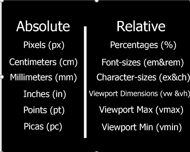
There are two types of length units: absolute and relative.
CSS Units-absolute lengths
Units that are “absolute” are the same size regardless of the parent element or window size. This means a property set with a value that has an absolute unit will be that size when looked at on a phone or on a large monitor (and everything in between!)
Absolute units can be useful when working on a project where responsiveness is not being considered. For example, desktop apps that can’t be resized can be styled for the default dimensions. If the window doesn’t scale, you don’t need the content to either.
| Absolute Unit | Description | Example |
|---|---|---|
| px | 1/96 of 1 inch (96px = 1 inch) | font-size: 12px; |
| pt | 1/72 of 1 inch (72pt = 1 inch) | font-size: 12pt; |
| pc | 12pt = 1pc | font-size: 1.2pc; |
| cm | centimeter | font-size: 0.6cm; |
| mm | millimeter (10 mm = 1 cm) | font-size: 4mm; |
| in | inches | font-size: 0.2in; |
Pixels (px) are typically the most popular absolute unit for screens. Centimeters, millimeters, and inches are more common for print and you may not have even known they were options
CSS Units-relative lengths
Relative units are useful for styling responsive sites because they scale relative to the parent or window size (depending on the unit).Relative units can be a little more difficult than absolute units in determining which to use, so let’s go through your options in detail.
| Relative Unit | Description |
|---|---|
| % | Relative to the parent element’s value for that property |
| em | Relative to the current font-size of the element |
| rem | Relative to the font-size of the root (e.g. the <html> element). “rem” = “root em” |
| ch | Number of characters (1 character is equal to the width of the current font’s 0/zero) |
| vh | Relative to the height of the viewport (window or app size). 1vh = 1/100 of the viewport’s height |
| vw | Relative to the width of viewport. 1vw = 1/100 of the viewport’s width. |
| vmin | Relative to viewport’s smaller dimension (e.g. for portrait orientation, the width is smaller than the height so it’s relative to the width). 1vmin = 1/100 of viewport’s smaller dimension. |
| vmax | Relative to viewport’s larger dimension (e.g. height for portrait orientation). 1vmax = 1/100 of viewport’s larger dimension. |
| ex | Relative to height of the current font’s lowercase “x”. |