
Tkinter Checkbutton is a GUI widget that provides a set of predefined options to the user. Users can select more than one option. A Checkbutton is an option that a user can choose to select or leave.
Syntax:
The Parameter master represents the parent window and options can be used as key-value pairs separated by commas.
Options of Tkinker CheckButton:
bd: The size of the border around the indicator. By default is 2 pixels.
bg: The normal background color displayed behind the label and indicator.
bitmap: To display a monochrome image on a button.
activeforeground: Foreground color when the checkbutton is under the cursor.
activebackground: Background color when the checkbutton is under the cursor.
command: A procedure to be called every time the user changes the state of this checkbutton.
fg: The color used to render the text.
height: The number of lines of text on the checkbutton. By default is 1
font: The font used for the text.
cursor: If you set this option to a cursor name (arrow, dot, etc.), the mouse cursor will change to that pattern when it is over the check button.
disabledforeground: The foreground color used to render the text of a disabled check button. The default is a stippled version of the default foreground color.
highlightcolor: The color of the focus highlight when the checkbutton has the focus.
pady: How much space to leave above and below the checkbutton and text. Default is 1 pixel.
padx: How much space to leave to the left and right of the checkbutton and text. Default is 1 pixel.
onvalue: Normally, a checkbutton’s associated control variable will be set to 1 when it is set (on). You can supply an alternate value for the on state by setting onvalue to that value.
offvalue: Normally, a checkbutton’s associated control variable will be set to 0 when it is cleared (off). You can supply an alternate value for the off state by setting offvalue to that value.
justify: If the text contains multiple lines, this option controls how the text is justified: CENTER, LEFT, or RIGHT.
variable: The control variable that tracks the current state of the checkbutton. Normally this variable is an IntVar, and 0 means cleared and 1 means set, but see the offvalue and onvalue options above.
wraplength: Normally, lines are not wrapped. You can set this option to a number of characters and all lines will be broken into pieces no longer than that number.
width: The default width of a checkbutton is determined by the size of the displayed image or text. You can set this option to a number of characters and the checkbutton will always have room for that many characters.
state: The default is state=NORMAL, but you can use state=DISABLED to gray out the control and make it unresponsive. If the cursor is currently over the checkbutton, the state is ACTIVE.
underline: With the default value of -1, none of the characters of the text label are underlined. Set this option to the index of a character in the text (counting from zero) to underline that character.
selectcolor: The color of the checkbutton when it is set. By default is selectcolor=”red”.
text: The label displayed next to the checkbutton. Use newlines (“\n”) to display multiple lines of text.
selectimage: If you set this option to an image, that image will appear in the checkbutton when it is set.
Relief: With the default value, relief=FLAT, the checkbutton does not stand out from its background. You may set this option to any of the other styles
Methods of Tkinker CheckButton:
There are some Methods of Tkinker CheckButton given below:
select(): Sets (turns on) the checkbutton.
toggle():Clears the checkbutton if set, sets it if cleared.
invoke(): This method is called to get the same actions that would occur if the user clicked on the checkbutton to change its state.
deselect(): Clears (turns off) the checkbutton.
flash(): Flashes the checkbutton a few times between its active and normal colors, but leaves it the way it started.
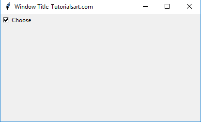
Example:
from tkinter import *

appWindow = Tk()
appWindow.title("Window Title-Tutorialsart.com")

appWindow.geometry('350x200')

chk_btn_state = BooleanVar()

chk_btn_state.set(True) #set check state

chk_btn = Checkbutton(appWindow, text='Choose', var=chk_btn_state)

chk_btn.grid(column=0, row=0)
appWindow.mainloop()
Output:
Comments are closed.