
An important element of the HTML form is < input type= “> in HTML. The type attribute of the input element can be of different types, which defines the information field. For example, < input type=”text “name=”name” > gives a text box.
The following is a list of all types of HTML element < input>.
| Type=“ ” | Description |
| text | Defines a single-line text input field |
| password | Define the input field of a single line password. |
| reset | Defines a reset button in the form to restore all the values. |
| checkbox | Defines checkboxes that allow multiple options of type to be selected. |
| button | Define a basic push button which can be programmed to accomplish an event mission. |
| file | Defines the file to be picked from system storage. |
| image | Sets a graphic submission button. |
| submit | Defines the button to submit the form to the server. |
| radio | Defines a radio button that allows one of the choices to be selected. |
HTML5 has introduced new styles on the element < input>. Below is a list of types of HTML5 elements
| Type | Description |
| Color | Define a common color field for the data. |
| Date | Defines the input field for the selection of dates. |
| datetime-local | Defines an input field for entering a date without a time zone. |
| Defines an entry field for an email address to enter. | |
| Month | Define a rule for the month and year, without time zone. |
| Number | Sets a field input for entering a number. |
| url | Sets a field to access URL |
| Week | Defines a area with week-year, without time zone to reach the year. |
| Search | Defines the text field of a single line to enter a search string. |
The definition with examples of types of < input > elements follows.
Text Form Input Types
In form Input types there are two types of text input types used.
- Single-line text input control
- Password input control
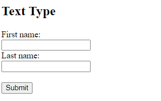
Form Input Types: Single-line text
This input type is used for items ,such as search bars or names which require only one line of user input. They are created using <input type=”text”>.
Note: Text is default input type and its length is 20 characters.
<form action="formoutput.html">
  <label for="fname">First name:</label><br>
  <input type="text" id="fname" name="fname" value=""><br>
  <label for="lname">Last name:</label><br>
  <input type="text" id="lname" name="lname" value=""><br><br>
  <input type="submit" value="Submit">
</form>
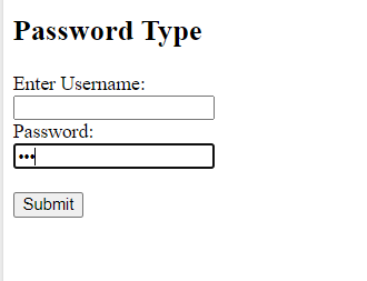
Password input control
This input is also single-line input but it masks the characters as soon as user enters it. This is created using <input type=”password”>.
<form action="formoutput.html">
  <label for="un">Enter Username:</label><br>
  <input type="text" id="un" name="un" value=""><br>
  <label for="pass">Password:</label><br>
  <input type="password" id="pass" name="pass" value=""><br><br>
  <input type="submit" value="Submit">
</form>
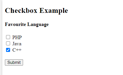
Form Input Type: Checkbox
Checkboxes are used when more than one options are required to be selected by user. This is created using <input type=”checkbox”>.
<form action="formoutput.html">
  <input type="checkbox" id="lang1" name="lang1" value="php">
  <label for="lang1"> PHP</label><br>
  <input type="checkbox" id="lang2" name="lang2" value="Java">
  <label for="lang2"> Java</label><br>
  <input type="checkbox" id="lang3" name="lang3" value="C++">
  <label for="lang3"> C++</label><br><br>
  <input type="submit" value="Submit">
</form>
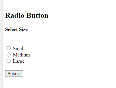
Input Type Radio Button
Radio buttons are used when only one option is required to be selected by user. This is created using <input type=”radio”>.
<form action="formoutput.html">
  <input type="radio" id="small" name="size" value="small">
  <label for="small">Small</label><br>
  <input type="radio" id="medium" name="size" value="medium">
  <label for="medium">Medium</label><br>
  <input type="radio" id="large" name="size" value="large">
  <label for="large">Large</label><br><br>
  <input type="submit" value="Submit">
</form>
Input Type Color
The <input type=”color”> is used to create an input field that allow user to pick the color and enter the color code.
<form action="formoutput.html">
  <label for="favcolor">Select your favorite color:</label>
  <input type="color" id="favcolor" name="favcolor" value="#F08080">
  <input type="submit" value="Submit">
</form>

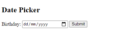
Input Type Date
The <input type=”date”> is used to create an input field that allow user to pick date. It includes year day and month.
<form action="formoutput.html">
  <label for="birthday">Birthday:</label>
  <input type="date" id="birthday" name="birthday">
  <input type="submit" value="Submit">
</form>
Tip: min and max attribute can be added to add restrictions to date.
To learn more form attribute you can visit https://www.tutorialsart.com/html-input-form-attributes/.
<form action="formoutput.html">
  <label for="tripdate">Enter a Trip date between 21-02-17 and 21-02-26 :</label>
  <input type="date" id="tripdate" name="tripdate" min="21-02-17" max="21-02-26"><br><br>
  <input type="submit" value="Submit">
</form>
Date Field Restriction
Input Type Datetime-local
The <input type=”datetime-local”> specifies an input field for date and time, with no time zone.
<form action="formoutput.html">
  <label for="birthdaytime">Birthday (date and time):</label>
  <input type="datetime-local" id="birthdaytime" name="birthdaytime">
  <input type="submit" value="Submit">
</form>
Local Date Field
Input Type Time
The <input type=”time”> specifies an input field for time, with no time zone. A time picker will be shown in input field depending on browser support.
<form action="formoutput.html">
  <label for="tim">Select Time:</label>
  <input type="time" id="tim" name="tim">
  <input type="submit" value="Submit">
</form>
Time Input Control
Input Type Email
The <input type=”email”> is used to create an input field that allow user to enter email address. The email address may be automatically checked when sent, it depends on browser support.
The email type is recognized by some smartphones and .com is applied to the keyboard to fit the email input.
<form action="formoutput.html">
  <label for="email">Enter your email</label>
  <input type="email" id="email" name="email">
  <input type="submit" value="Submit">
</form>
Email Field
Input Type File
The <input type=”file”> specifies an input field as a browse button that allow user to upload file.
<form action="/formoutput.html">
  <label for="myfile">Select file:</label>
  <input type="file" id="myfile" name="myfile"><br>
  <input type="submit" value="Submit">
</form>
File upload
Input Type Month
The <input type=”month”> is used to create an input field that allow user to select month and year. A date picker will be shown in input field depending on browser support.
<form action="formputput.html">
  <label for="jmonth">Joining(month and year):</label>
  <input type="month" id="jmonth" name="jmonth">
  <input type="submit" value="Submit">
</form>
Month Field
Input Type Search
The <input type=”search”> is used to create search fields.
Note: Search fields behave like a text field.
<form action="formoutput.html">
  <label for="bsearch">Search Book:</label>
  <input type="search" id="bsearch" name="bsearch">
  <input type="submit" value="Submit">
</form>
Search Field
Input Type Tel
The <input type=”tel”> is used to create an input field that allow user to enter phone number with respect to given format.
<form action="formoutput.html">
  <label for="phone">Enter a phone number:</label><br><br>
  <input type="tel" id="phone" name="phone" placeholder="0xxx-xxxx-xxx" pattern="[0-9]{4}-[0-9]{4}-[0-9]{3}" required><br><br>
   <input type="submit" value="Submit">
</form>
Telephone Field
Input Type Submit
The <input type=”submit”> specifies a button for submitting form data to form-handler(define in action attribute which process the input data).
<form action="formoutput.html">
  <label for="fname">First name:</label><br>
  <input type="text" id="fname" name="fname" value=""><br>
  <label for="lname">Last name:</label><br>
  <input type="text" id="lname" name="lname" value=""><br><br>
  <input type="submit" value="Submit">
</form>
Note: The browser itself gives default name to the button if there is no value attribute added in input element.
<form action="formoutput.html">
  <label for="fname">First name:</label><br>
  <input type="text" id="fname" name="fname" value=""><br>
  <label for="lname">Last name:</label><br>
  <input type="text" id="lname" name="lname" value=""><br><br>
  <input type="submit">
</form>
Input Type Submit
Input Type Reset
The <input type=”reset”> specifies a button reset button that reset all the form values to their default values.
<form action="formoutput.html">
  <label for="fname">First name:</label><br>
  <input type="text" id="fname" name="fname" value=""><br>
  <label for="lname">Last name:</label><br>
  <input type="text" id="lname" name="lname" value="Smith"><br><br>
  <input type="submit">
  <input type="reset"><br>
</form>
Reset Button
Input Type Button
The <input type=”button”> specifies a clickable button .
<input type="button" onclick="alert(Thank you for Clicking)" value="Click Me!">
Input Button
Input Type URL
The <input type=”url”> is used to create an input field that allow user to enter URL address. The URL address may be automatically checked when sent, it depends on browser support.
The URL type is recognized by some smartphones and .com is applied to the keyboard to fit the URL input.
<form action="fromoutput.html">
  <label for="fburl">Add your facebook URL:</label>
  <input type="url" id="fburl" name="fburl">
  <input type="submit" value="Submit">
</form>
URL Input Field
Input Type Number
The <input type=”number”> specifies numeric input field that allow user to enter numeric values. Restrictions can be added to these numeric value using min and max attribute.
<form action="formoutput.html">
  <label for="agelimit">Age should be (between 18 and 25):</label>
  <input type="number" id="agelimit" name="agelimit" min="18" max="25">
  <input type="submit" value="Submit">
</form>
Number Field
Tip: To set the the intervals between numeric values step attribute can be added in input element.
<form action="formoutput.html">
  <label for="quantity">Quantity:</label>
  <input type="number" id="quantity" name="quantity" min="0" max="50" step="5" value="15">
  <input type="submit" value="Submit">
</form>
Numeric Steps
you can enter a value from 0 to 50, in steps of 5. The default value is 15:
Input Type Range
The <input type=”range”> specifies a control like a slider control. It is typically used when its not important to enter exact value.
Note: Default range is from 0 to 100 but it can be changed using min, max and step attributes.
<form action="formoutput.html" method="get">
  <label for="brightness">Brightness (between 20 and 100):</label>
  <input type="range" id="brightness" name="brightness" min="20" max="100">
  <input type="submit" value="Submit">
</form>
Range Field
Input Type Week
The <input type=”week”> is used to create an input field that allow user to select week and year. A date picker will be shown in input field depending on browser support.
<form action="formoutput.html">
  <label for="week">Select a week:</label>
  <input type="week" id="week" name="week">
  <input type="submit" value="Submit">
</form>