The histogram in R is used to represent variable values frequency. The difference between histogram and barplot is that histogram groups the values into continuous ranges. To create a histogram in R we used the hist() function. The height of the bars represents the frequency of that variable. The histogram takes a vector as input and produces a histogram plot.
Following is the basic syntax of the histogram in R:
Here:
- v is a vector
- main indicates title
- col is used to set bar colour
- border is used to set border
- xlab is used to give x-axis description
- xlim is used to specify x-axis range
- ylim is used to specify y-axis range
- breaks is used to mention the bar width
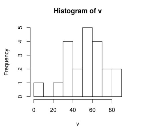
Creating the Histogram in R
The histogram is created using the hist function.
v <-  c(34, 7,87,64,32,54,64,32,76,56, 34,57,85,25,78,65,54,43,65,55,43)

hist(v)
Output:
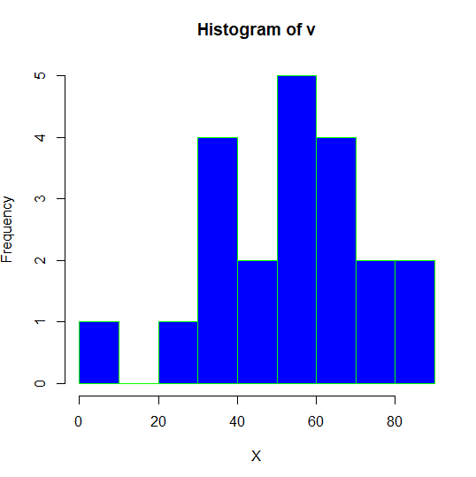
Color of Histogram
We can change the color of the histogram using col and border parameters.
v <-  c(34, 7,87,64,32,54,64,32,76,56, 34,57,85,25,78,65,54,43,65,55,43)

hist(v,xlab = "X", col = "blue",border = "green")
Output
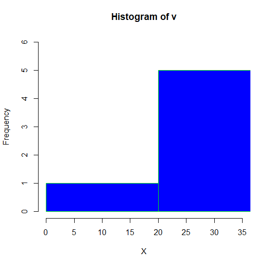
Range of X and Y values
To set the range of the X-axis and Y-axis, we can use the xlim and ylim parameters. We can set the width of the bar using the breaks parameter.
v <-  c(34, 7,87,64,32,54,64,32,76,56, 34,57,85,25,78,65,54,43,65,55,43)

hist(v,xlab = "X", col = "blue",border = "green", xlim = c(0,35), ylim = c(0,6), breaks = 3)
Output